At work, I sometimes find myself trying to explain the difference between different modelling or machine learning techniques. For example, the difference between regression models and decision trees. But simply explaining how they work algorithmically rarely gives somebody that satisfying feeling of intuition that is the product of understanding.
Seeking to understand, people will often ask when one technique works better than another. This is a good question and it helps to see how different techniques perform on different problems. One way to visualise this is to compare plots of decision boundaries. Given a supervised learning problem where there are points of two classes (let's say red and blue), we can train machine learning techniques to predict which class a hypothetical point should belong to.
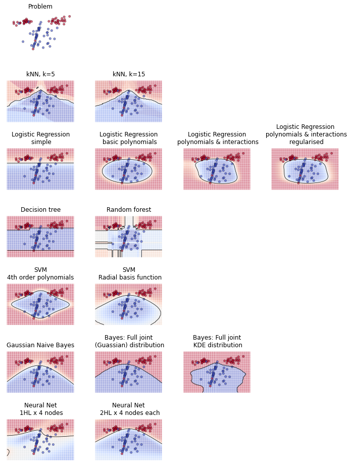
Here's an example produced by a little Python script I whipped up. In the first plot is a randomly generated problem - a two-dimensional space with red and blue points. We then train a variety of machine learning techniques on that problem. Their task is to discriminate between the red and blue points. We can illustrate their solution by colouring the space red or blue depending on what class they predict that region belongs to.
To reiterate, the space is coloured according to whether the machine learning technique predicts it belongs to the red or the blue class. (For some techniques, we can use shade to represent their strength of belief in the colour of the region. For example, if a model predicts a high probability that a region is blue, then we shade that area darker blue). The line between coloured regions is called the decision boundary.
The first thing you might look for is how many points have been misclassified by being included in an incorrectly coloured region. To perfectly solve this problem, a very complicated decision boundary is required. The capacity of a technique to form really convoluted decision boundaries isn't necessarily a virtue, since it can lead to overfitting.
The main point of these plots, though, is to compare the decision boundaries that techniques are capable of. Looking at how different techniques try to solve the problem helps to develop an intuition of how they work. For example: regression, which must solve the problem using a linear equation, is only capable of continuous boundaries. Whereas decision trees, which proceed by bisecting continuous variables, can partition the space into isolated "blocks."
... and so on. Here's another example:
This problem illustrates the problem of overfitting. Simple, first-order linear regression is only capable of straight-line boundaries, whereas when we add interactions and polynomial terms then it can form curved boundaries. The straight-line solution of simple logistic regresion will almost certainly generalise better than the convoluted boundary produced when we add polynomial terms and interactions. Regularisation can address the problem of overfitting by constraining the polynomial & interaction coefficients and thus, visually speaking, limiting the flexibility of the boundary.
Here's another example, with a more difficult problem:
This problem is tricky because the red & blue classes are in opposing quadrants. Clearly, no straight line decision boundary is going to work and simple regression fails dismally. Problems where the classes form multiple clusters are often suited to k-Nearest Neighbours or tree based approaches.
Here's one last example of a difficult problem in which the blue points separate two groups of red points:
Here's the Python script I used to generate these plots. It's not the most elegant code, but it's clear and easy to tinker with. I run it in a Jupyter notebook. You can tweak the make_classification() function to generate different problems.


